
Built the complete brand identity for Kando Sounds from the ground up. Logo, visual system, Shopify storefront, and social media.
Logo
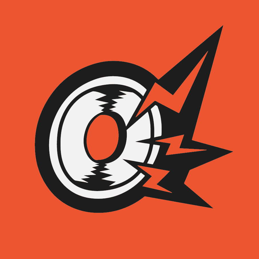
The Kando Sounds logo draws from hip-hop art and graffiti culture. Inspired by media such as Jet Set Radio, I loved how rebellious and energetic the aesthetic was. The lettering stays clean and sans-serif though, to keep it feeling professional and not too chaotic.


Color scheme
The palette was kept deliberately minimal: orange, off-black, and off-white. The restraint of a three-colour system creates strong visual contrast and ensures every branded material feels cohesive

Website
The Kando Sounds Shopify storefront was built and launched in under two weeks. The site carried the full visual system through to every page, using the custom colour scheme and typography to create a consistent experience from landing page to checkout.
Social Media
Social media content extended the Kando Sounds visual identity across platforms, maintaining consistency between the storefront and the brand's online presence. Posts were designed to reflect the same bold, graffiti-influenced aesthetic as the logo and website.


